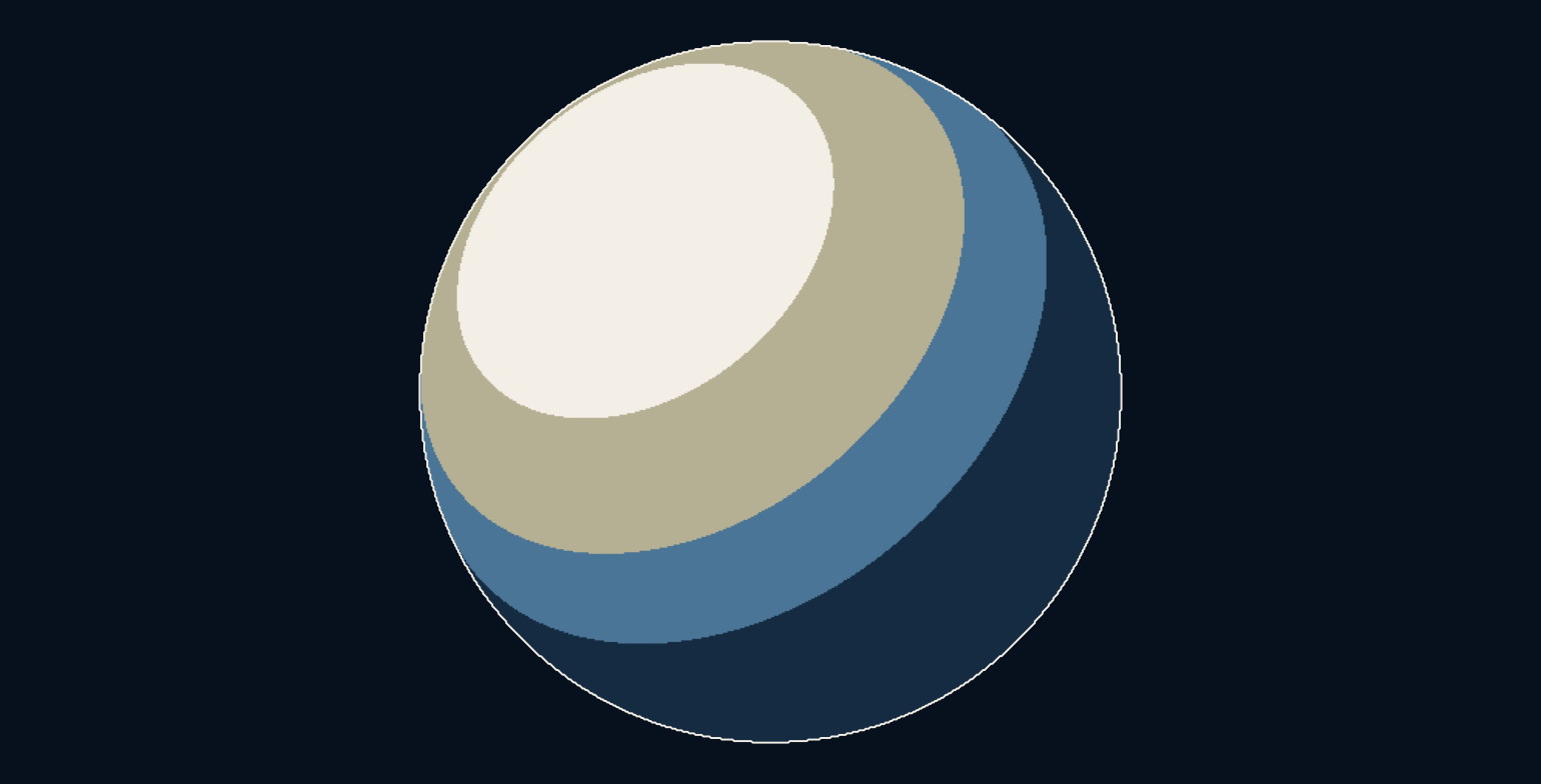
Why can a perfectly round sphere look as if someone painted its shadows?
A smooth object normally offers a gradual change from light to shade. In a stylised rendering, that continuous range can become a handful of flat regions. The geometry remains round, but the decisions about how to show it become deliberately selective. An analytic sphere lets us separate the shape, the lighting calculation and the graphic choices.
A shading band is a decision about presentation.
The sphere has a direction at every point
At each visible point on a sphere, the surface normal points outward. This normal tells a lighting model which way the surface faces. We generate the front hemisphere directly from its equation, so no mesh, texture painting or modelled character is involved. The outline is circular because of the geometry, not because a shading filter discovers it.
The light is represented by a normalized direction proportional to minus 0.5, 0.6 and 0.8. A dot product compares the surface normal with that direction. Where they align, the value is high. Where the surface turns away, it falls. Negative values are clamped to zero because this simple diffuse term does not illuminate the back-facing side.
Smooth shading supplies the starting value
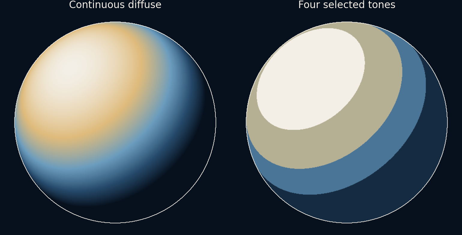
The continuous image uses this clamped dot product, a Lambert-style diffuse shading term. It is a simplified directional-light calculation, not a complete physical renderer. We omit interreflection, cast shadows, specular highlights, texture and exposure. That restricted setup makes the relation between surface orientation and the displayed gradient easier to inspect.
A palette maps the resulting values into the article's navy, blue and gold colours. Those colours are a visual encoding rather than measured material reflectances. A low value means the chosen diffuse term is small; it does not establish how a real painted sphere would look under an actual lamp in a room.
Four tones replace a continuum
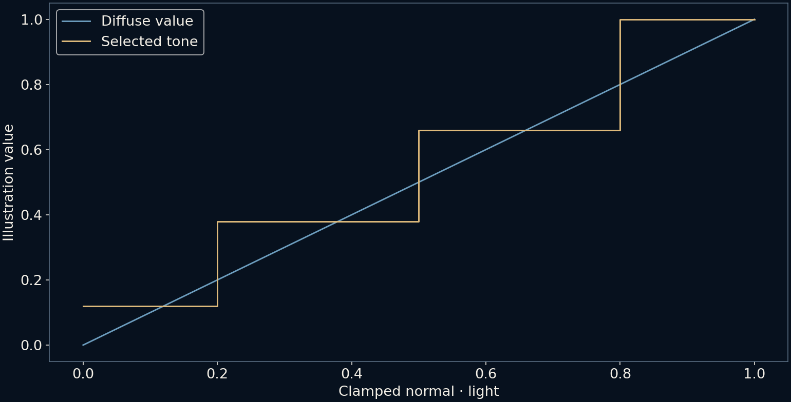
The stylised version applies thresholds at 0.2, 0.5 and 0.8. Values below the first threshold become 0.12; the next ranges become 0.38 and 0.66; the brightest range becomes one. The script confirms that exactly four output levels appear on the visible sphere. Each region shares one chosen value despite having continuously changing normals underneath.
The transfer plot is a staircase. Its horizontal portions explain the flat-looking patches, while its jumps explain the sharp boundaries between tones. This rule is an artistic mapping, not an approximation that converges toward realistic light simply by making the boundaries more precise. Moving a threshold is a design choice about which surface directions should share a tone.
Lighting moves the borders without changing the object
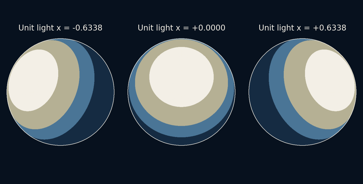
The three comparison spheres use the same shape and thresholds but different horizontal light directions. The bands shift across the surface because different normals now cross the thresholds. A region can change abruptly from one tone to another even while the light moves smoothly. That abruptness is built into the quantizer.
In animation, such boundaries may shimmer or pop when small movements cross a threshold, especially near thin features or coarse pixels. Smoothing a boundary, adjusting the shading rule or considering temporal stability can help a particular design, but each changes the visual result. Our still images demonstrate the source of the discontinuity rather than testing an animation technique.
Outlines are another independent decision
Comic-like rendering often includes dark contours, ink marks, simplified textures or carefully placed highlights. These are separate choices from dividing diffuse shading into bands. The thin outline in our illustration follows the known sphere boundary; it is not a general edge detector applied to an arbitrary 3D scene.
A production style may combine geometry, material rules and hand-authored art to keep a character readable from many angles. Merely using four tones does not automatically reproduce the line quality, composition or selective detail of a drawing. The exercise isolates one useful ingredient instead of treating a whole visual style as a single switch.
Simplification can preserve the right cues
The sphere still reads as curved because its silhouette and the arrangement of regions carry information about its form. Removing intermediate shades does not remove every shape cue. It reorganizes the cues into larger graphic groups that can suit a particular aesthetic or make a subject easier to read at a small size.
The useful question is which distinctions the image needs to retain. A technical inspection may require continuous shading or other diagnostics; a character illustration may benefit from deliberate grouping. Neither rendering is universally better. The comparison shows how the same geometry can support different visual explanations when the mapping from calculation to colour changes.
Further reading
PBRT: Diffuse reflection ↗Khronos: GLSL step threshold ↗Original documentation and useful background.